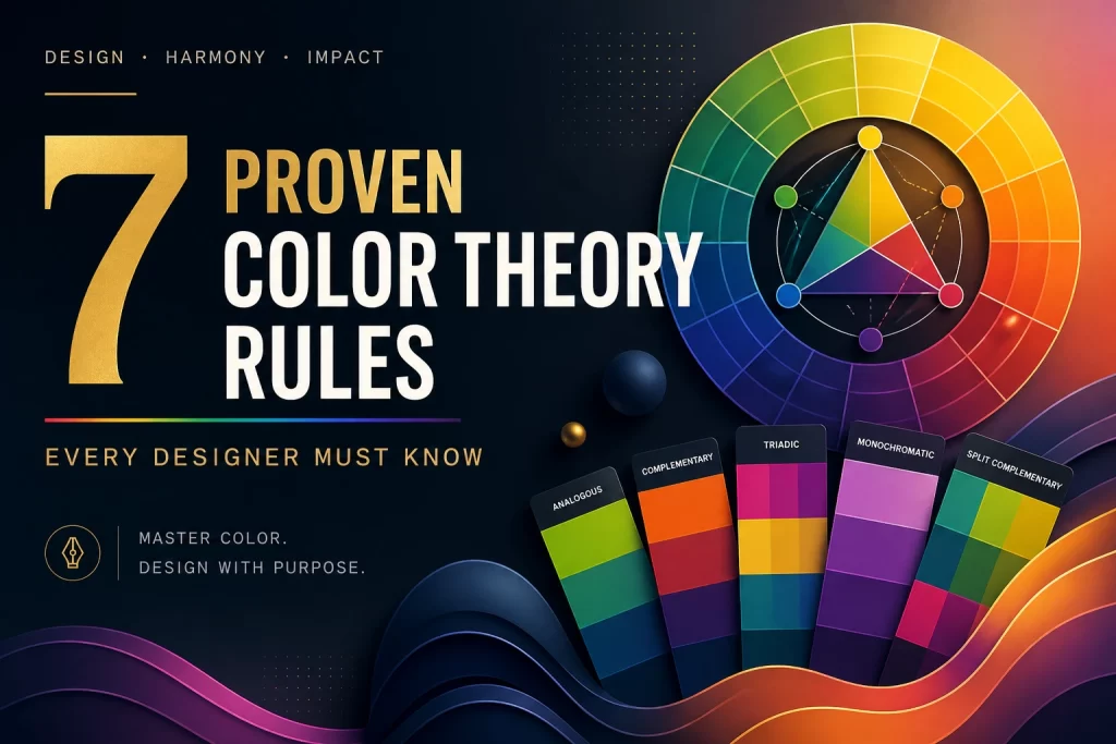
Color Theory in Graphic Design: 7 Proven Rules Every Designer Must Know
Mastering Color Theory in Graphic Design is important for graphic designers, brand strategists, and content creators.
Color is the most powerful element in design. Humans react emotionally to colors before they read your text, understand your messages, or even click your CTA.
Studies suggest that even before a user reads or judges a design, 60-90% of their first impression is formed within just 5 seconds based on color.
Whether you are designing websites, social media graphics, web banners, logos, etc., understanding color theory can not only improve engagement and conversions but can also build user trust in your brand.
What is Color Theory and Why is it Important in Graphic Design?
Understanding Color theory is basically understanding how a design visually impacts a user’s behavior.
It helps designers understand how colors work together and use them in a more smart way while creating a design by combining color palettes based on color psychology.
It also plays an important role in creating balance, evoking emotions, improving readability, and establishing visual hierarchy in a particular design.
Color Theory not only guides the creation of an eye-catching, beautiful design but also helps establish brand identity, influence viewers emotions, and guide user attention through intentionally created harmonious palettes.
Therefore, Good Color = Better Conversions
Basic Principles of Color Theory in Graphic Design
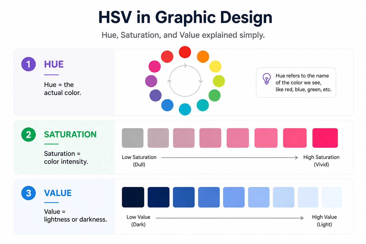
Hue, Saturation, and Value in Graphic Design
One of the most important concepts in Color Theory is understanding three color elements: hue, saturation, and value. It’s a model that defines color by its intensity and lightness.
- Hue is basically a pure form of color red, green, blue, yellow, etc., which is displayed on a color wheel ( explained in the next section).
- Saturation indicates the intensity or purity of a color. High saturation means vibrant and energetic, whereas Low saturation means muted and soft. Highly saturated colors quickly grab attention, making them ideal for advertisements and CTAs.
- Value depicts how light or dark a color appears. Designers usually use value in their design to:
Improve readability, add depth, and create visual hierarchy.
One of the best combinations for accessibility and having a better user experience is having dark text on a light background.
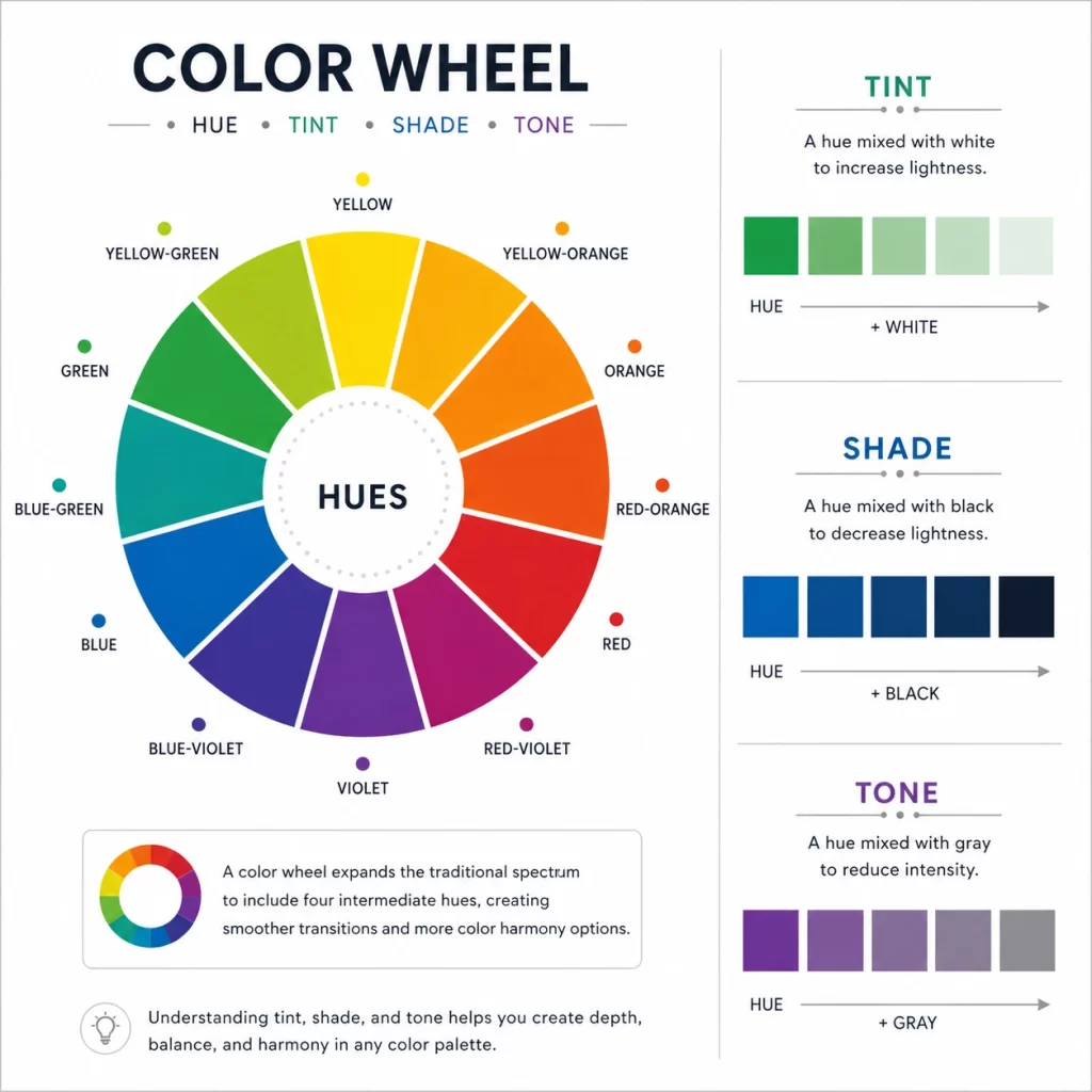
Understanding the Color Wheel in Graphic Design
Color theory in Graphic Design uses the color wheel to define the three most important types of color.
Color Wheel is a foundational tool in graphic design that helps you create Color Combinations that feel natural and balanced. The color wheel is categorized into three parts: Primary, Secondary, and Tertiary colors, as defined in the diagram below:
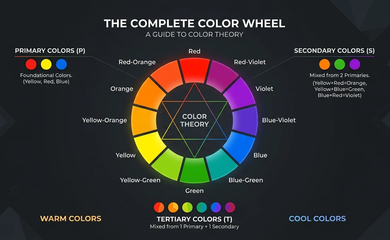
Warm and Cool Color in Graphic Design
Color defines the emotional understanding and visual temperature in graphic design. Colors are divided into two categories: Warm Colors and Cool Colors.
- Warm colors include red, orange, yellow, etc. These colors bring warmth, comfort, energy, passion, and excitement. That’s why most food chain brands use yellow and red in their branding.
- Cool Colors include Blue, Green, Purple, etc. These colors communicate Coolness, trust, calmness, and Professionalism. Research shows that Blue is one of the most preferred colors used by many Tech and Finance Brands because trust and professionalism are its main characteristics.
You can see the color wheel diagram above to know what cool colors and warm colors are.
Tint, Shade, and Tone in Color Theory
Let’s briefly discuss tint, shade, and tone. They are variations of a base color(hue) that are created by adding white, black, and gray.
- Tint is a lighter color created by adding white to the base color; it is often considered a pastel shade.
- Shade is a darker version, mostly a deeper or richer color created by adding black to the base hue, and
- Tone is a more subtle, less saturated color created by adding gray color, i.e., a mix of white and black, which looks more toned down. Deeply described in the diagram below:
Color Schemes in Graphic Design
Many people notice that certain colors used together are pleasing to the eyes. Designers notice these combinations as Color schemes.
Color schemes in Graphic Design are combinations of colors that help maintain consistency, harmony, and create contrast in a design. Let’s go through the 7 types of color schemes in Graphic Design:
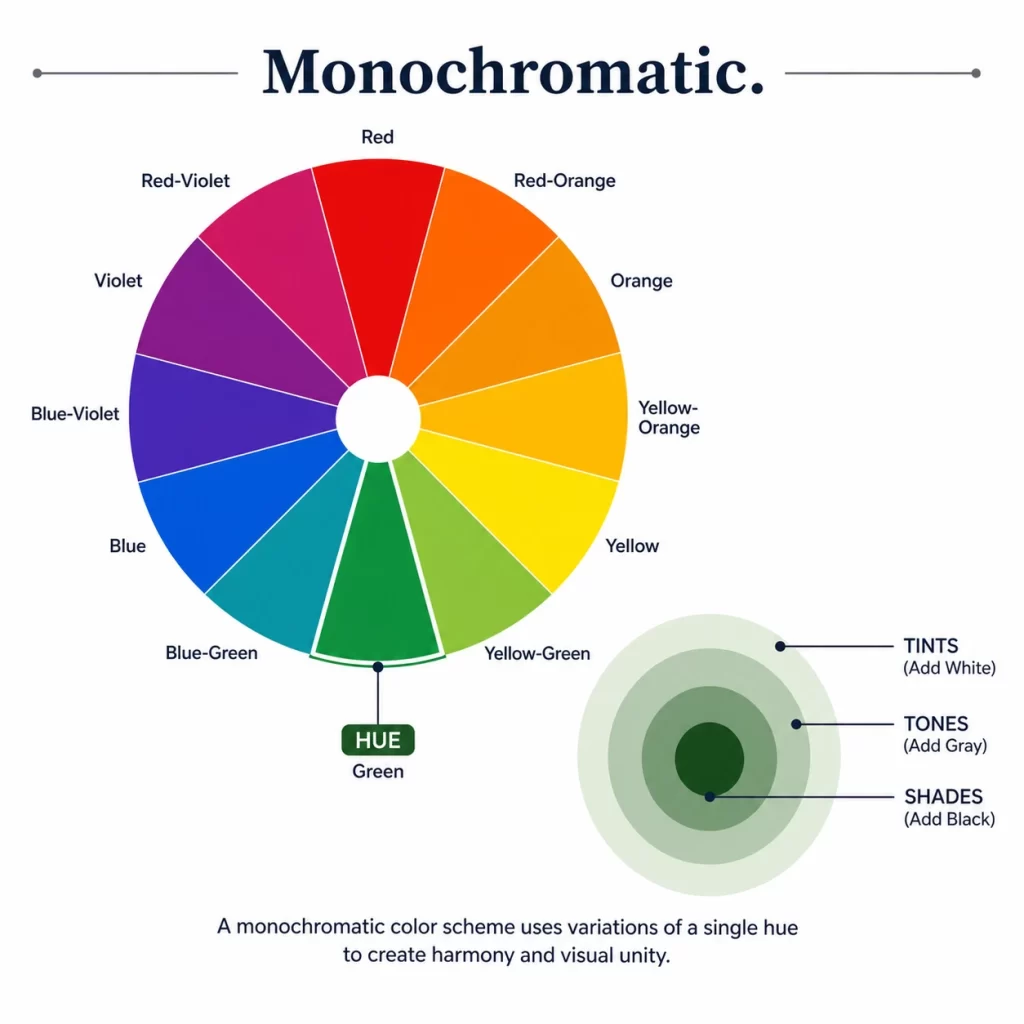
Monochromatic Color Scheme:
- Monochromatic Schemes include Shades, Tints and Tones of a single hue to create a more balanced and unified look. Monochromatic schemes usually range from black and gray, but today brands use other colors too.
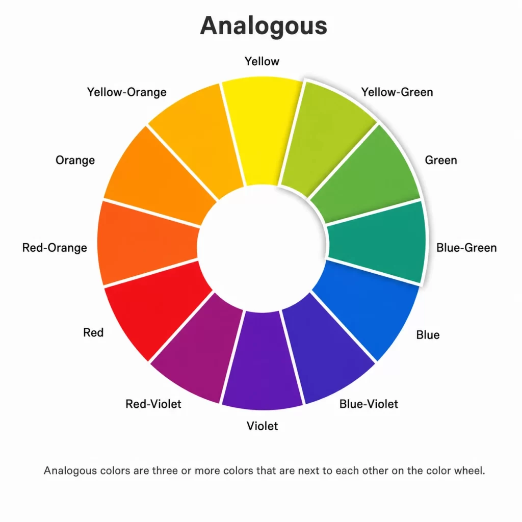
Analogous Color Scheme:
- An Analogous color consists of a color family of three or more colors adjacent to each other on a color wheel, such as yellow, yellow-orange, and orange, which create a comfortable design.
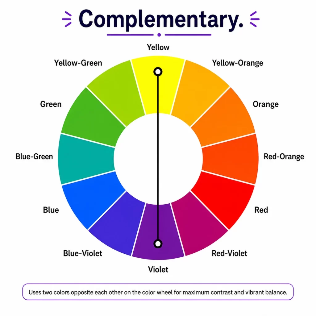
Complementary Color Scheme:
- Colors opposite each other on a color wheel are complementary colors, such as red and green, yellow and purple, or blue and orange. Most sports franchises use high-contrast complementary colors that are visible across the whole stadium.
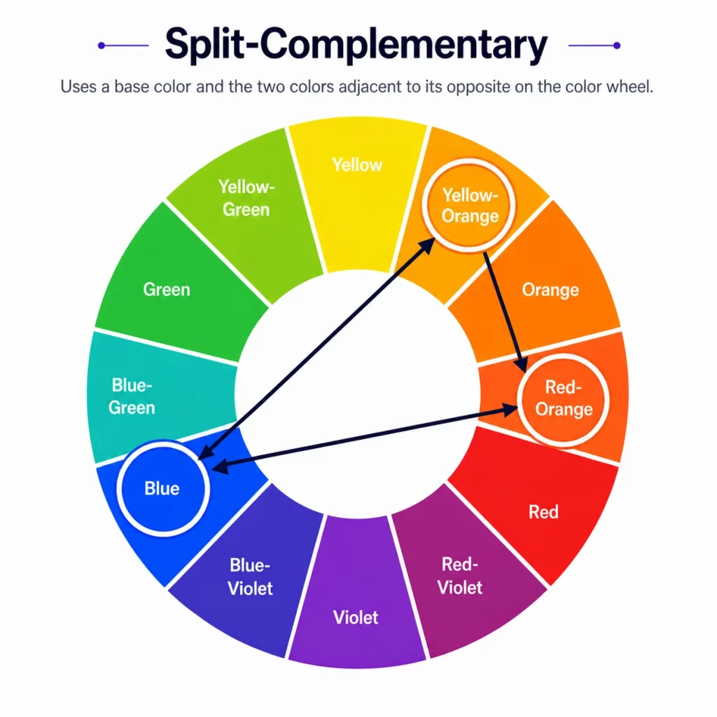
Split-Complementary Color Scheme:
- This scheme uses a base color; instead of using the direct opposite, it uses two colors adjacent to its complement. It gives designers a wider color palette to play with and have balance in design.
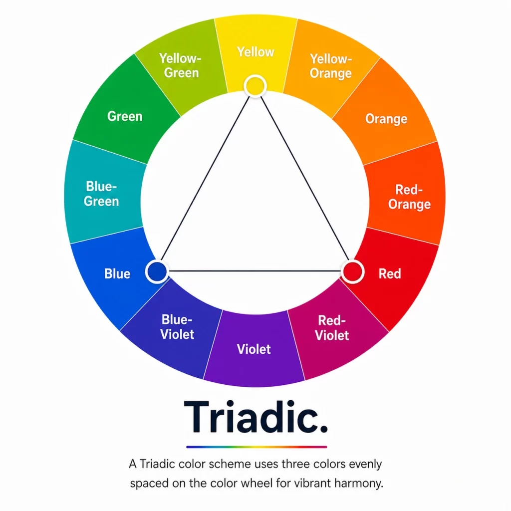
Triadic Color Scheme:
- This scheme gives you a triangle on the wheel—like orange, purple, and green. This creates a more vibrant, energetic, and balanced look, even if the colors are desaturated.
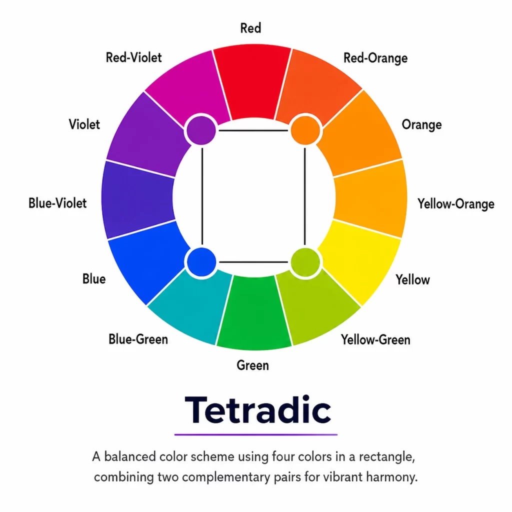
Tetradic Color Scheme:
- Tetradic Scheme is most complex where four colors are arranged in two complementary pairs. Therefore, designers use this Color scheme when one color is dominant and requires careful balancing to avoid visual clutter.
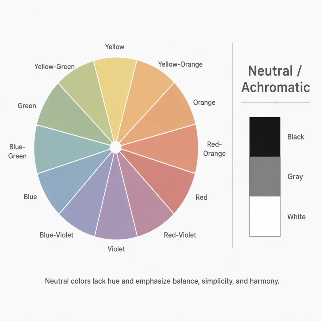
Neutral and Achromatic Color Scheme:
- Use a colorless palette, such as black, white, and various gray tones, to create a sophisticated, clean, and minimalist design. As a result, these are mostly popular in Minimalist Branding and Packaging.
How Color Psychology Affects Graphic Design:
Color psychology depicts how colors influence humans in terms of emotions and behavior.
Let’s take a look at a certain color, what it depicts about human psychology:
- Blue color brings trust and stability.
- Red depicts passion and urgency.
- Green is for growth and nature.
- Black is a more versatile color that indicates luxury and sophistication.
Brands use color psychology to connect with their target audience more effectively.
What Is the 60-30-10 Rule in Color Theory?
One of the most effective rules in Color Theory is the 60-30-10 rule, which is a popular color balance technique defined as:
- 60% dominant color (eg, a white background)
- 30% secondary color (eg, Blue hue sections)
- 10% accent color (eg, an orange CTA button)
This rule helps create visual balance and a professional-looking design.
Want to create perfect color palette faster? Don’t miss our guide on AI tools for graphic designers.
What Are the Most Common Color Schemes in Graphic Design?
How Do I Choose the Right Color Palette for a Design?
What are common mistakes designers make with color?